Brand Identity
Each product, business, or individual has a unique personality and voice. Working together, we’ll determine your brand’s characteristics and find a way to visually express them. It’s sort of like giving birth: what was once a gleam in your eye now has a body and soul. Creating a corporate identity is always an exciting process for us and our clients.

The Hotel Metropole, on Santa Catalina Island, needed a fresh identity after an extensive remodel. This logo reflects the casual elegance of the new decor while capturing the breezy, beachy feel of the oceanfront property.

The Natural Resources Defense Council’s Green Gifts program lets the organization’s 1.4 million members—and anyone else—send environmentally themed gifts and greetings. We designed the logo and website to be warm and welcoming to first-time users as well as old friends.
Three Point Digital, a television and film post-production company, asked for a strong, contemporary logo and a versatile mark that worked well on all their marketing materials.
The founders of Monte de Oro, a new winery, asked for a classic look that would signal tradition and quality. Monte de Oro means Mountain of Gold, as the vineyard sits on a sunny hillside in Temecula, California. With that as inspiration, we created a sun-and-mountain logo in gold brush stokes, which became the foundation of the award-winning winery’s brand.
Woof Records—a British underground label—wanted branding that was lighthearted and creative. With a name like Woof, it was just begging for a dog.
Stratosphere Entertainment’s logo captures the company’s energy and forward-focused brand. The “S” reads like a twister—powerful and maybe a little dangerous.

Vox Humana is a company that educates groups and individuals on the art of spoken communication. The logo references the name and creatively depicts the sounds of the human voice.
Popshots — a line of brightly colored nail polishes marketed for teenaged girls — called for a young, fun, feminine identity. The line sold well and the identity looked great on all P.O.P. materials and packaging.
The owner of Picture Palace, a television production company, loves art deco movie theaters. Deco architecture etched in reverse, along with a 1930s typeface, deliver the era’s look and feel.

The Academy of Interactive Arts and Sciences 4th Annual Interactive Achievement Awards needed an identity as electrifying as the video games being honored. Vivid colors and digitally manipulated images reflect the excitement of the games.
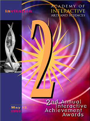
The identity for the Academy of Interactive Arts and Sciences 2nd Annual Awards had a dual focus: the award statuette and the thrill of video gaming. The “2” graphic and background were used on all promotional materials.
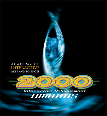
The Academy of Interactive Arts and Sciences was created to recognize outstanding innovations in the field of video games. The 2000 Interactive Achievement Awards identity was one of the Academy’s early incarnations.
