
Packaging
Six seconds is all you get to grab the typical shopper’s attention. In a flash, packaging must signal your product’s quality, benefits, and the essence of your brand. Above all, it has to be memorable — on the shelf, online, and in ads.

Wine labels are notoriously challenging. The bottles must be easy to spot, impossible to forget, and convey the character of the winery. Our logo — inspired by the name and executed with foil-stamped gold brush strokes on a black background, along with elegant typography — met the client’s brief for labels with a top-quality, classical look and feel.
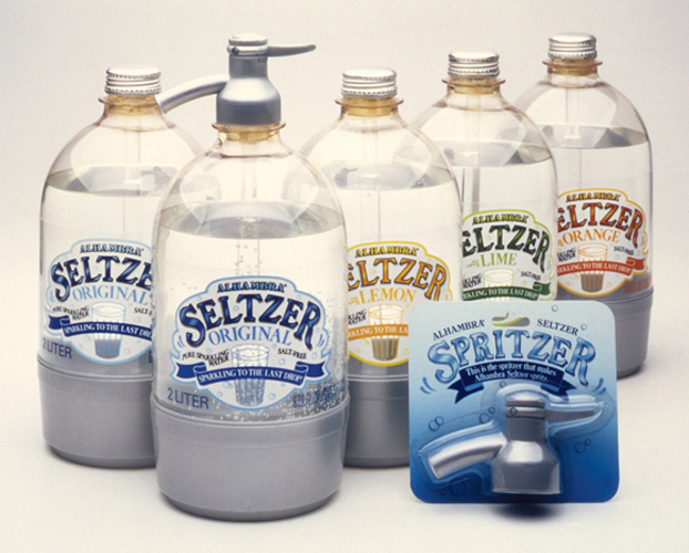
Retro can say “artisanal” — the hand-lettered, “soda fountain window” style on the unique packaging for this line of flavored seltzer waters is fun and conveys the craftsmanship of a bygone era. For The Chambers Group.

Our brief was to design a line of yogurt packages that had a European feel and reflected Alta Dena’s brand position of healthy, pure products. The cream-colored tub stands apart from other yogurt packaging, and the elegant lettering and delicate illustrations promise a Continental-style treat.
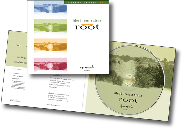
We always welcome our clients’ ideas and input. For this meditation music CD, we featured one of the client’s own landscape photographs. The tinted images suggest different levels of consciousness.
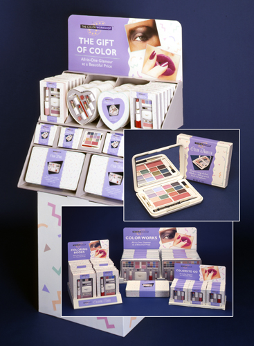
The candy-box feel of this line of cosmetic gift packages was created with a mass-market/drugstore consumer in mind. The Color Workshop featured a gift-wrapped design and a background that could be refreshed each season while maintaining a strong visual identity. Point-of-purchase displays were designed to showcase the products to best advantage.

The identity and packaging for this Jamaican food company’s product communicate the colorful Caribbean source of the recipes and the owner’s personality and love for the cuisine of her culture while maintaining a strong retail shelf impact.
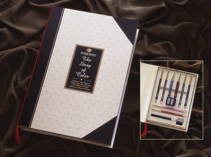
The Color Institute — a high-end line of cosmetic gift packaging for retail stores — was presented in packages constructed like books with titles like “The Story of Lips” and “The Story of Eyes”. We designed the logo, packaging and sales materials using a pearlescent cream background with tiny gold stars finished off with red tassels to create a luxurious identity.
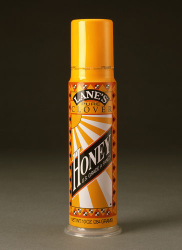
This client found a new way to dispense honey: a press-top container with a narrow vertical format that created a challenge for us. Using a fun border of bees and a sunny, retro, graphic approach, the design displayed all the necessary copy and stood out on the shelf. For The Chambers Group.
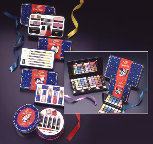
Packaging for a winter season of the Color Workshop cosmetic gift product line projects a strong visual identity with a rich, vibrant color palette. Colored bands with photographs and description of the contents wrap around each package to reinforce the feeling of a fun, exciting gift.